Constro Introduction
This documentation will give you an understanding of how Constro Theme is structured and guide you in performing the most common functions. If you require further assistance, related to topics not covered in this documentation, then please contact us via Our Support Forum
If you want to customize this Theme as per your requirement, please contact us here: Our Support Forum
Author: Potenza Global Solutions www.potenzaglobalsolutions.com
Constro Theme Components
- Open the ... /constro-umbraco-theme Folder to find all the Source Files
- Constro Theme contains:
- Constro Theme - Source Folder (Visual Studio 2015 Solution File/ Umbraco 7.5.4)
- DB - (Database For Theme)
- Packages Folder - Packages Folder
- - uSky Slider - (Revolution Slider)
- - Smart Blog - (For Blog)
- Documentation - Documentation Folder
Configuration
Follow the steps below to get started with your Constro Umbraco Configuration:
Back Office Access
To open umbraco back office use following username/password.
Username: info@potenzaglobalsolutions.com
Password: monto@123
How to run with Visual Studio
Checkout the videos we have created to help you. Videos
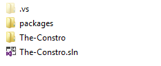
- First restore (in SQL Server 2012.) the database backup file from DB folder in source package.
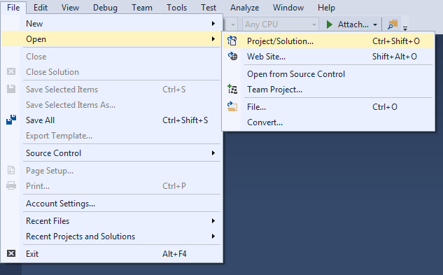
- Open constro_umbraco.sln solution file in visual studio platform. (Visual Studio 2013 or higher)
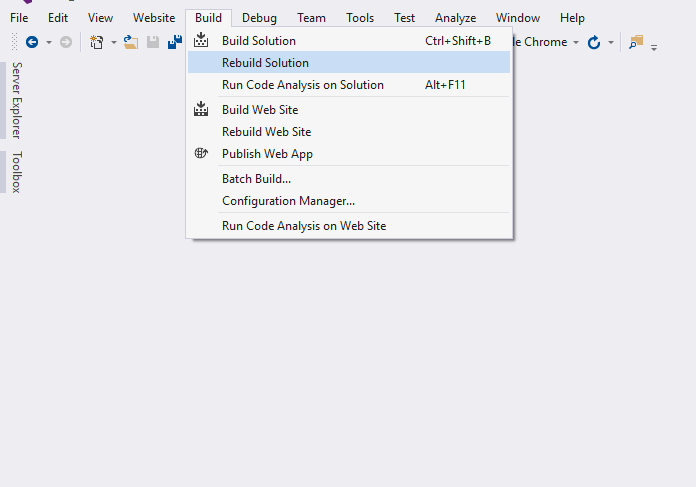
- Change the connection string in Web.config file. Re-build the solution. Nuget package will get restored.
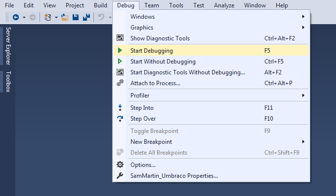
- Go to debug menu from visual studio and click start debugging from sub menu.
Export/Import
Export
1.) First go to developers tab and right click on Created Packages menu.
2.) Select create and enter name of your package and click on create.
3.) Enter the package details as per requirements in Package Properties tab.
4.) Now select the package contents one by one as per the requirement in Package Content tab.
5.) Now select installer file and bin files from respected folders in Package Files tab.
6.) Enter any specific details related to package in Package Actions tab.
Import
Umbraco Setup
Umbraco is one of the most popular CMS in the world that makes it the best choice for your website.
You can download and install the Umbraco from their official website
For more information on Umbraco, please, visit the Umbraco page.
Theme Requirements:
Please check the recommended umbraco version for proper functioning of kit:
– Umbraco v7.5.4
Make sure your server is set up properly so the kit and content will be loaded correctly.
Package Requirements:
Please install following packages first:
- LeBlender
- Nested Content
- Umbraco Forms (Trial Version)
- uSky Slider
- Smart Blog
- Spectrum Color Picker
Import Package
- Package install steps:
- 1. After logging in to your umbraco backend go to Developers tab.
- 2. Click on Packages on left side navigation.
- 3. Now click on Install Local option on top right corner.
- 4. Drag or upload your prefered layout package file given in drag area.
- 5. Now accept the license and let the package install.
- 6. After package get installed you can see it in installed tab.
- You're now good to go..! Start adding your Content and show off your Brand New Beautiful Website in style.
Theme Settings
Constro theme comes with user friendly settings which help user to make changes in site without any hesitation. The theme settings are divided in 2 parts.
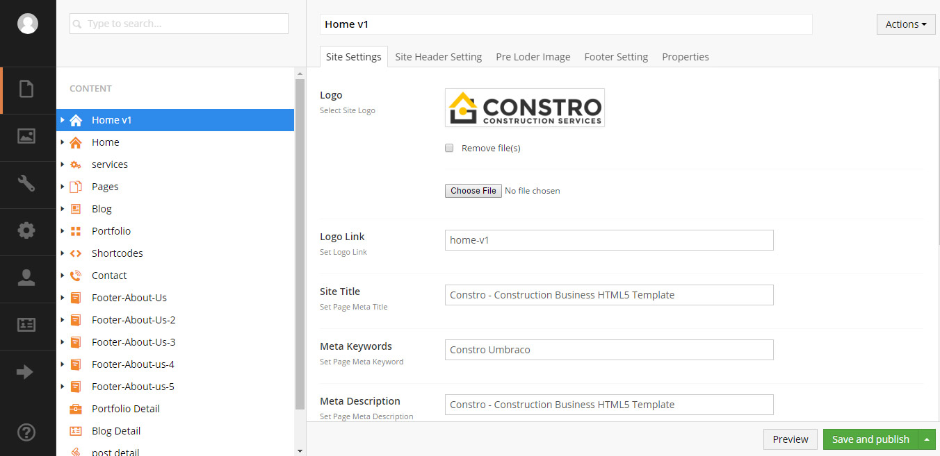
- Site Settings - To change logo, add meta data, site title, author name, favicon.
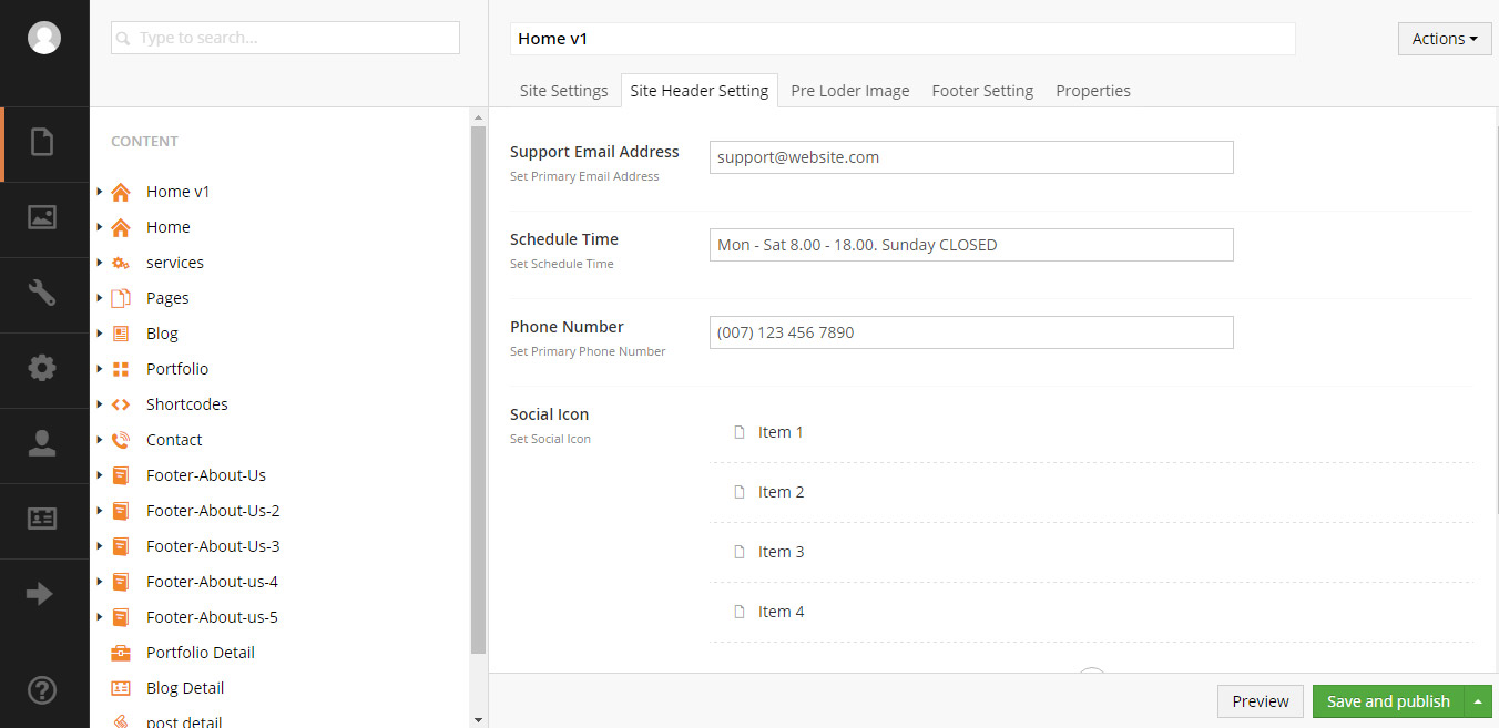
- Site Header Settings - To add email, phone number, social icons in header.
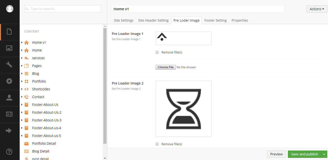
- Pre Loader Image - To change preolader for page load.
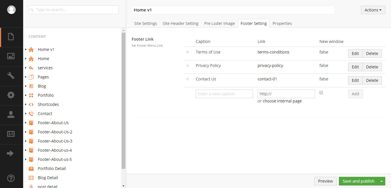
- Footer Settings - To add navigation links in footer.
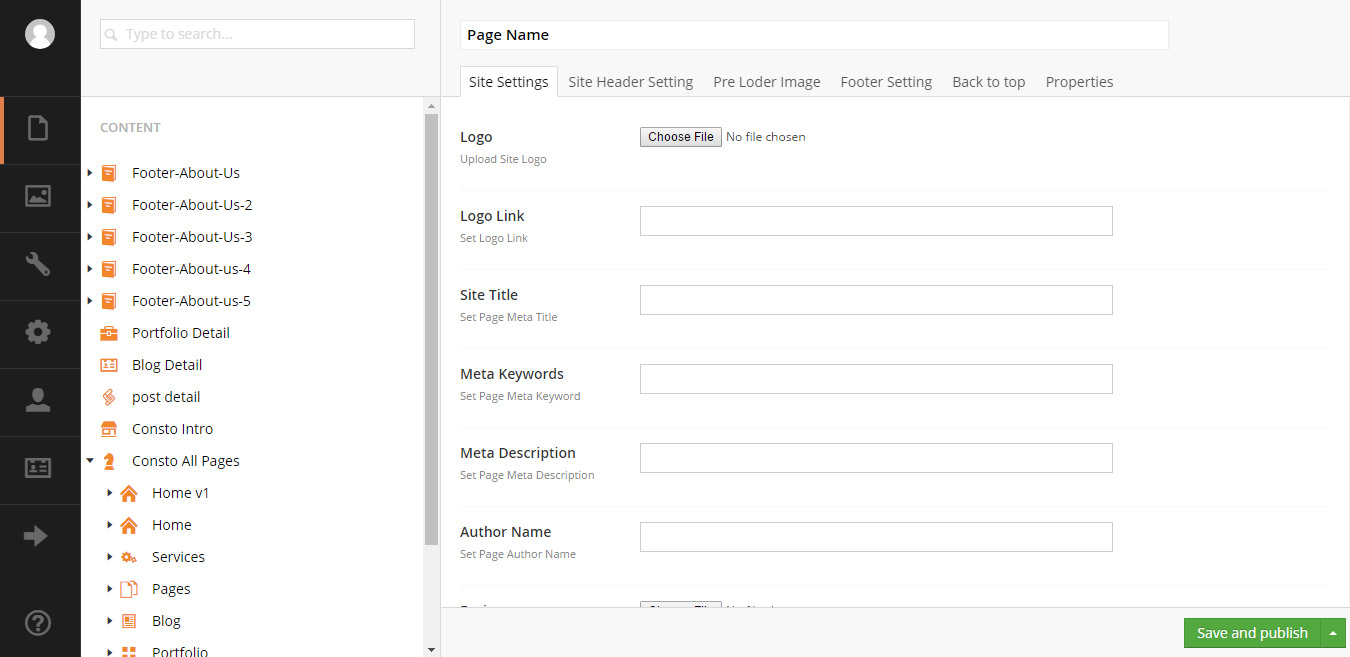
Site Setting
To change logo, add meta data, site title, author name, favicon.
To add email, phone number, social icons in header.
Pre Loader Image
To change preolader for page load.
To add navigation links in footer.
Page Setting
Constro Theme comes with user friendly page creation interface. User can easily create new page, sub page, sub section etc.
Add Master Page
1. Right Click on Content and select Create from the drop down.
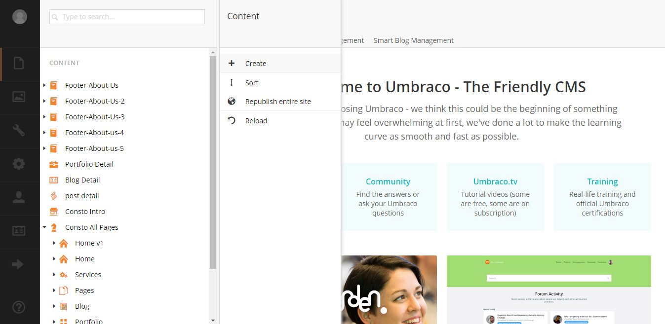
2. Then select Site Master from sub drop down.
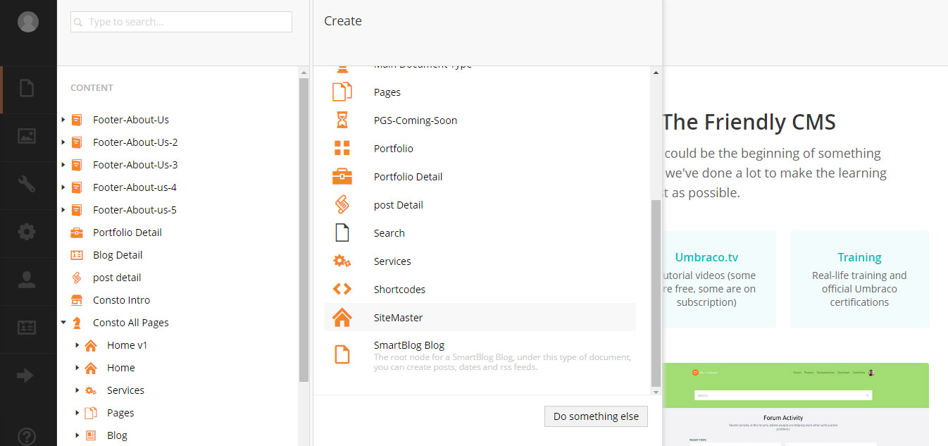
3. Enter your desire name for page and enter all the details required for page and click on Save and Publish button at bottom of page.
Add Child Page
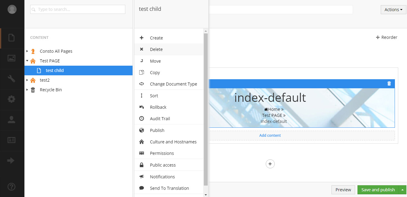
1. Right Click on Parent Page and select Create from the drop down.
2. Then select Child Page from sub drop down.
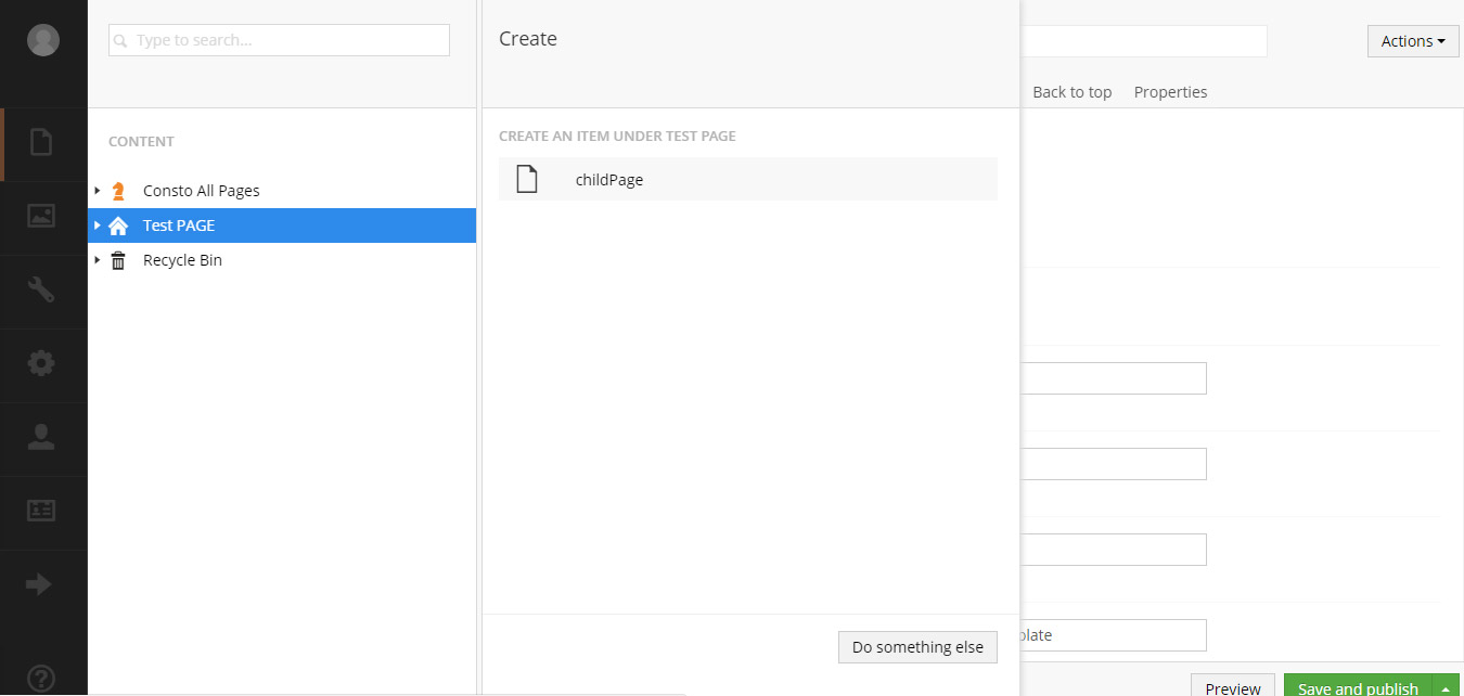
3. Enter your desire name for page. Then click on Save and Publish button at bottom of page.
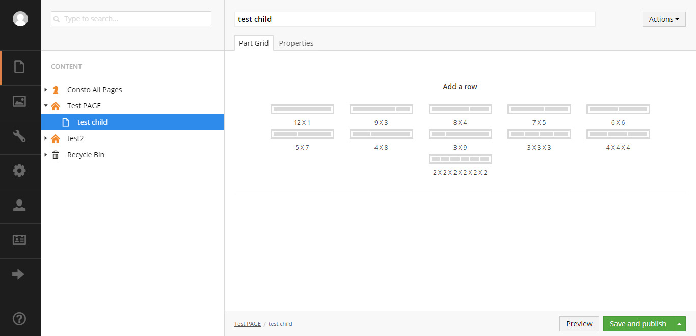
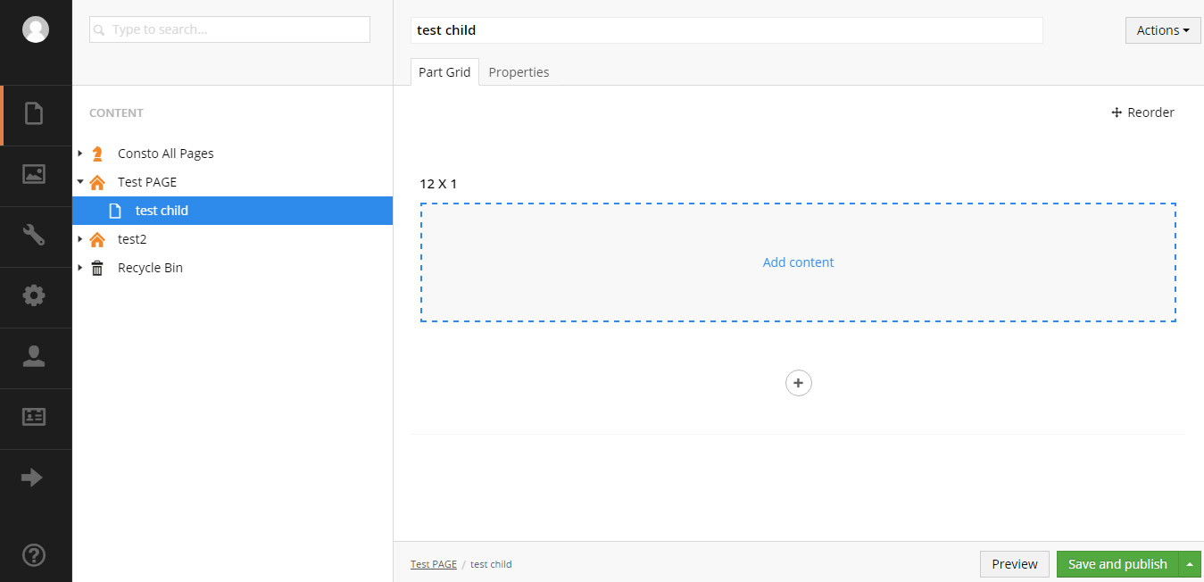
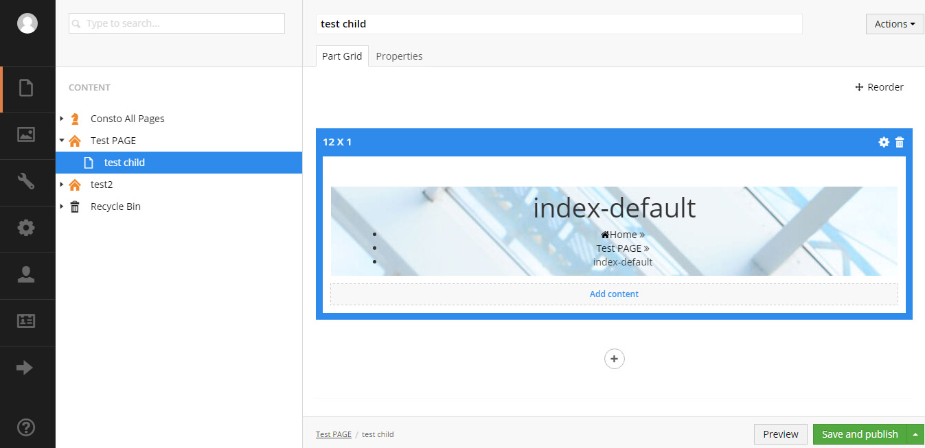
Add Row
1. To take advantage of bootstrap we have created few grid options. There are 11 pre made grid options. Select any one option from the list.
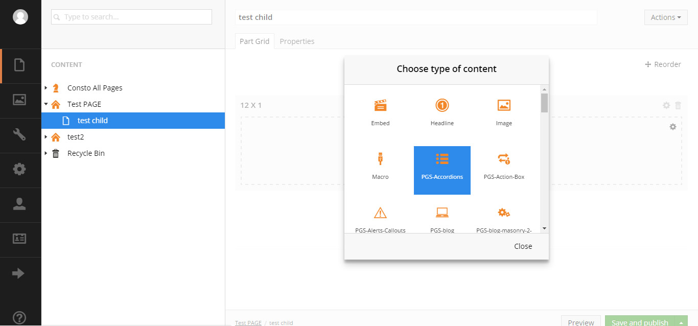
Add Shortcode
1. As we have added the row now we will add shortcode/content. Click on add content and select your desire shortcode from the list.
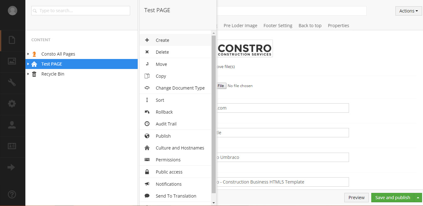
Delete Master Page
1. Right click on your page and select Delete from the drop down. Then click on ok button to delete the page.
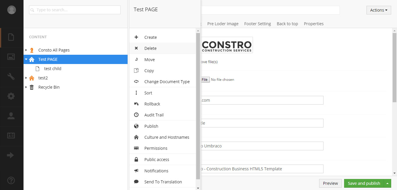
Delete Child Page
1. Right click on your page and select Delete from the drop down. Then click on ok button to delete the page.
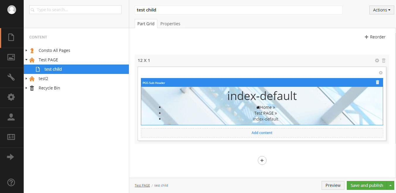
Delete Row
1. Select the row. It will be highlighted in blue color. Then click on delete icon on top right corner of row.
Delete Shortcode
1. Select the content you want to delete. It will be highlighted in blue color. Then click on delete icon on top right corner of row.
Shortcodes
Shortcodes are reusable elements. Setting up shortcodes is very easy & self-explanatory. Here is the list of Shortcodes included with Constro:
- Accordion
- Action box
- Alerts and Callouts
- Buttons
- Sections
- Columns
- Counter
- Countdown
- Data table
- Lists style
- Post style
- Skills
- Social icon
- Testimonials
- Tabs
- Team
- Timeline
- Typography
Browser Support
Constro theme support all major browers like Google Chrome, Mozilla Firefox, Safari, Opera, Internet Explorer 9 and Above.
Change Log
Version 1.0
- Initial Release
Source & Credits
All images and are for preview purposes only and are not included in the download files. Images are of copyrights under Creative Commons CC0.
Images and mockups
Scripts
CSS & Fonts
Umbraco Packages
Support
Have any queries related to Constro Umbraco Theme. Feel free to contact our support. We will try to help you as soon as possible. Contact our support by creating ticket:
https://potezasupport.ticksy.com/